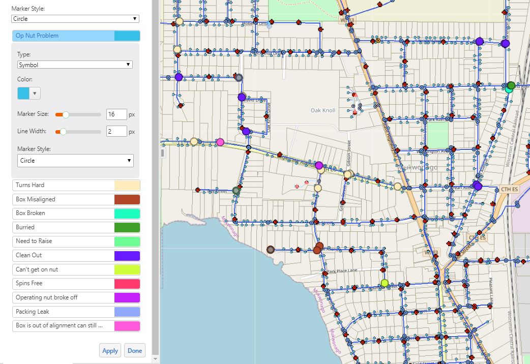

As you may know by now, you are able to create and view custom layer visualizations in your GIS. The extent of what you are able to do with these customization options is extensive, so we encourage you to get creative! In this example, we will guide you through the process of visualizing various valve repairs needed by displaying an array of colored markers. This could be a simple & effective way for your field crew to prioritize the urgency of repairs needed. It is also a great system for sharing a larger amount of data with a variety of qualities, in a clearer and more concise manner. The example below is an image of what your GIS will look like after you turn on water valve repair layer.

In order to change visualizations, we click on the arrow next to "Valve Repairs Needed."

Next, we click on "Turn on/off layer visualizations."

This allows us the option to select from multiple drop-down menus. In this case, we would like to view the various types of repairs that are needed within the village. As you can see, things are getting a little nutty around here!

After we click "Apply," our valve repairs are now distinguishable based on a variety of colors.
We should also mention that you are able to edit the way individual attribute qualities are displayed, if so desired. If you hate the color beige and cannot stand to look at it any longer, no worries! You can switch it to any color you would like!